Пользуюсь недавно, но с уверенностью могу сказать, что из всех подобных приложений остановлюсь на этом. Прекрасный дизайн, отличный функционал. Спасибо автору!
Mobile View drops a real phone or tablet right on top of the page you’re viewing — so you watch the desktop and the mobile‑adaptive layout side by side, in real time. No DevTools, no resizing windows.
Works on any website · Settings saved across tabs · Nothing ever leaves your browser
From the community
Пользуюсь недавно, но с уверенностью могу сказать, что из всех подобных приложений остановлюсь на этом. Прекрасный дизайн, отличный функционал. Спасибо автору!
Super buena extensión, muy práctica e innovadora
Great app! My team has started using it. The developer actively takes feedback and is super responsive.
这个多端模拟器太好用了,简直完美,还免费!感谢作者!
Watch the demo
One click, and a real device frame appears over your page — desktop and mobile, side by side.
Made for everyone
Whether you ship code, craft interfaces, or just want to check how a page looks on a phone.
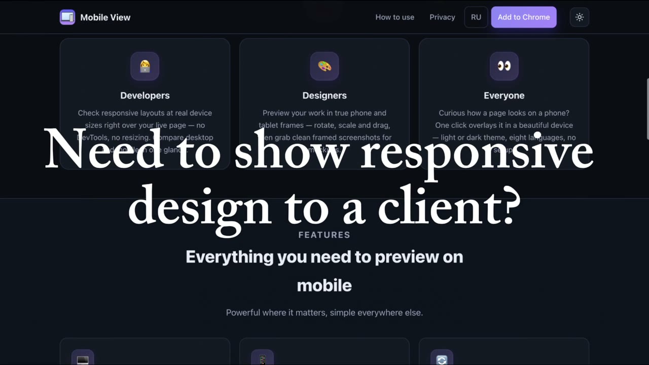
Check responsive layouts at real device sizes right over your live page — no DevTools, no resizing. Compare desktop and up to 5 phones or tablets in one glance.
Preview your work in true phone and tablet frames — rotate, scale and drag, then grab clean framed screenshots for mockups.
Curious how a page looks on a phone? One click overlays it in a beautiful device — light or dark theme, 50+ languages, no setup.
Features
Powerful where it matters, simple everywhere else.
Show your desktop page next to several phones and tablets on one screen — each with its own model, size, rotation and brand color. Scrolling stays in sync across all of them, and a side dock keeps every device one click away.
Switch from Classic to Workspace and lay phones, tablets and monitors on one board — pick a background, scale and rotate each device, save favorites, and keep desktop and mobile views in sync side by side.
The device preview floats over your real desktop page, so you see both adaptive layouts on one screen — live, no split windows.
iPhone, Android (Pixel, Galaxy) and iPad with authentic bezels. Rotate to landscape, scale the preview from 50% to 125%, and set a custom size — quick Shift+5 shortcut.
Scroll, click and type on any side — the desktop page and every device preview stay in sync. Toggle sync anytime.
Dim the desktop and arrange your devices in a row, grid or stack. Turn on focus lock and a stray click, Esc or Shift+4 can’t knock you out — only the Focus button exits. Quick Shift+4 shortcut.
Capture every device at once and pick the shot you need, or record the screen to an MP4 or WebM video — all locally, with quick Shift+1/2/3 shortcuts.
Device, rotation, position, theme and language are saved and restored across tabs and sessions — in 50+ interface languages.
Made for real workflows
Desktop and mobile live on one screen — so a single recording or screen‑share shows how a page looks and behaves on every device. No split screens, no editing.
Record a single MP4/WebM walkthrough with desktop and mobile side by side — ready to send, no post‑production.
Show clients exactly how their site behaves on phone and desktop — live on a call or in a shared clip.
Present responsive work like a pro — ideal for freelancers and agencies, with zero setup.
Three steps
Go to the page you want to check and click the Mobile View icon — a real device appears right on top of it.
Pick an iPhone, Android or iPad, rotate, scale and drag it anywhere — add up to 5 devices at once, or switch to focus mode for a clean look.
See desktop and mobile together, scroll in sync, and save a framed screenshot. Your setup is remembered next time.
Be first to hear about updates, vote on the next features and share your feedback — you help decide what comes next.
Join on TelegramAdd Mobile View to Chrome and preview any page in both views at once.
Add to Chrome — Free